
I decided to accept my own challenge so I downloaded and installed R. It’s a huge system with a lot to learn but I did manage to figure out enough to generate some basic statistics and a couple graphs. I’ll be using the same data as in the 10,000 Steps post, but I won’t bother to reproduce the table here (it’s in the org file for this post, of course, I’m just not exporting it).
If you want to use R with Babel you really need to read the Org-babel-R page. Babel works a little differently with R and it’s easy to waste a lot of time trying to get things to work because you weren’t aware of those differences.
The first thing I wanted to do was calculate some basic statistics from the data. Nothing fancy, just maximum value, minimum value, mean, median, and standard deviation. That’s pretty easy in R because there are R primitives for them.
Here’s the code block for the basic statistics. As before, steps is the table of data. The in[,2] is the second column of that data (it’s a slice of the array that Babel creates from the table for R’s use). I put it in vals just to avoid typing in[,2] over and over. The only tricky part was figuring out how to form the output array but that’s because I don’t really know R yet.
#+BEGIN_SRC R :var inp=steps :exports results
vals <- inp[,2]
array( c("Max", "Min", "Mean", "Median", "Std. Dev.",
  max(vals), min(vals), mean(vals), median(vals),
  sd(vals)), dim=c(5, 2))
#+END_SRC
Here’s the resulting table:
| Max | 18078 |
| Min | 840 |
| Mean | 11665.6428571429 |
| Median | 12572 |
| Std. Dev. | 5372.68656994208 |
Next I wanted to generate a pie chart showing the distribution of steps in groups of 1,000. I was thinking that I’d have to do some low level programming to build the frequency table. It turns out, however, that R has the hist command that will do that for you. It will even plot a histogram. All you need to do is pass it the data and indicate where you want the breaks to be. This simple code block
#+BEGIN_SRC R :var inp=steps :file http://irreal.org/blog/wp-content/uploads/2011/05/wpid-hist.png :results graphics :exports results
hist(inp[,2], breaks=0+1000*(0:19), plot=TRUE, main="Steps Histogram", xlab="Steps")
#+END_SRC
results in the the following histogram.
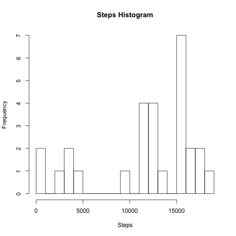
Most of the arguments to hist involve setting the graph and axes labels.
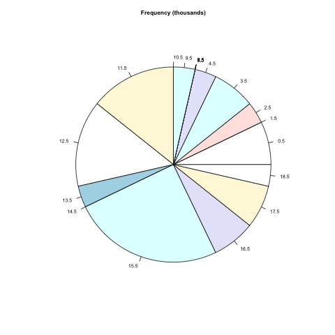
The output of hist is really an object (think structure) that has entries for things like the bucket breaks, bucket midpoints, and bucket counts. You can see that in action in the next code block, which uses hist again but with no plotting. Instead the output object is captured and used as input to the pie primitive.
#+BEGIN_SRC R :var inp=steps :file http://irreal.org/blog/wp-content/uploads/2011/05/wpid-pie-steps.png :results graphics :R-dev-args pointsize=7 :exports results
ftab <- hist(inp[,2], breaks=0+1000*(0:19), plot=FALSE)
pie(ftab$counts, labels = ftab$mids/1000, radius=.75, main="Frequency (thousands)")
#+END_SRC
I had to scrunch up the pie chart a bit to prevent the bucket labels from colliding too much. Still, it’s a nice chart for very little effort.
If you do any work involving statistics, R is definitely a tool you need. Of course, if you do any work involving statistics, you already know that. Using Org-mode and Babel is a great way to have all the data, graphs, and text for a paper in one file that can then easily be exported to HTML or LaTeX. I’ve said before that I really like Babel and the more I use it and learn about it the more I like it.