Unlike many hackers, I don’t care for a dark-themed Emacs so I use the basic black on white screen. Lately this scheme has begun to feel overly bright and I thought I would try some lower contrast colors. I’ve browsed the Solarized color scheme several times and thought it looked great on the Web site. So I downloaded Solarized and color-theme, made the necessary changes to my init.el, and bounced Emacs. The next thing I did was to comment out the enabling Emacs Lisp in my init.el and bounce Emacs again. I absolutely hated using the color scheme. At first I couldn’t figure out why I didn’t like it; as I said, it looked great on the Web site. I finally realized that I didn’t like working with the low contrast colors. The syntax highlighting didn’t stand out as well and I had a hard time reading some of the shades.
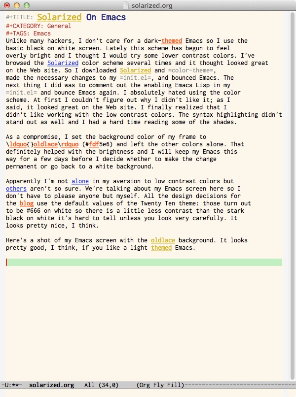
As a compromise, I set the background color of my frame to “oldlace” (#fdf5e6) and left the other colors alone. That definitely helped with the brightness and I will keep my Emacs this way for a few days before I decide whether to make the change permanent or go back to a white background.
Apparently I’m not alone in my aversion to low contrast colors but others aren’t so sure. We’re talking about my Emacs screen so I don’t have to please anyone but myself. All the design decisions for the blog use the default values of the Twenty Ten theme. Those turn out to be #666 on white so while there’s a little less contrast than the stark black on white it’s hard to tell unless you look carefully. I think it looks nice and is easy to read.
Here’s a shot of my Emacs screen with the oldlace background. It looks pretty good, I think, if you like a light themed Emacs.

